A NEW LOOK FOR THE
MUNICIPALITY OF SOTKAMO

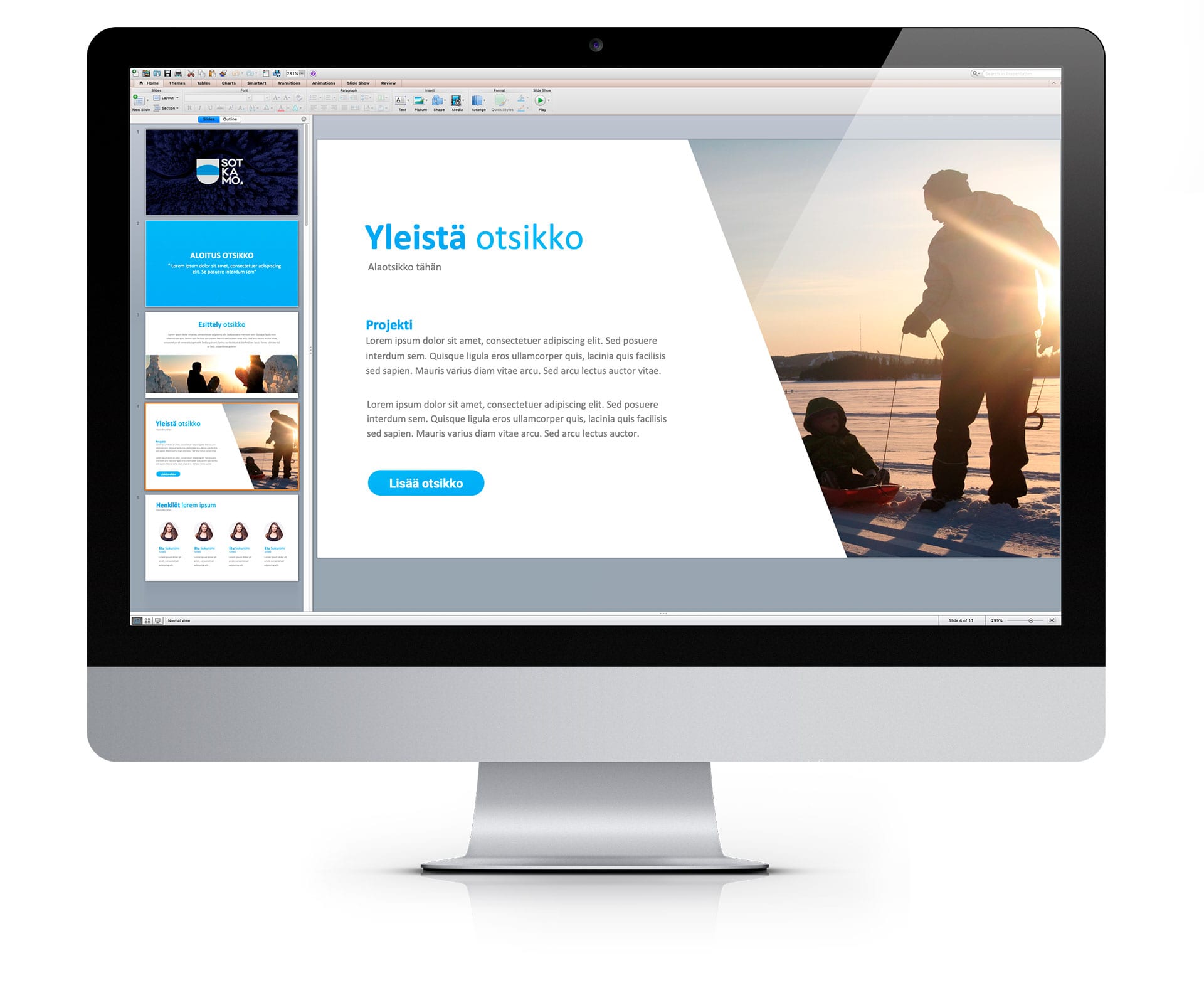
The municipality of Sotkamo had a clear need to renew its visual appearance. Sotkamo didn’t have its own logo yet, and the communication also needed to be reformed. We set out to carry out the assignment in accordance with this. In the planning we took into account the strengths of the municipality of Sotkamo, the people of Sotkamo, and the communication strategy. The renewed logo, look, graphic instructions and animation now bring a consistent marketing and communication look to the municipality of Sotkamo. Sotkamo is now successfully branded!

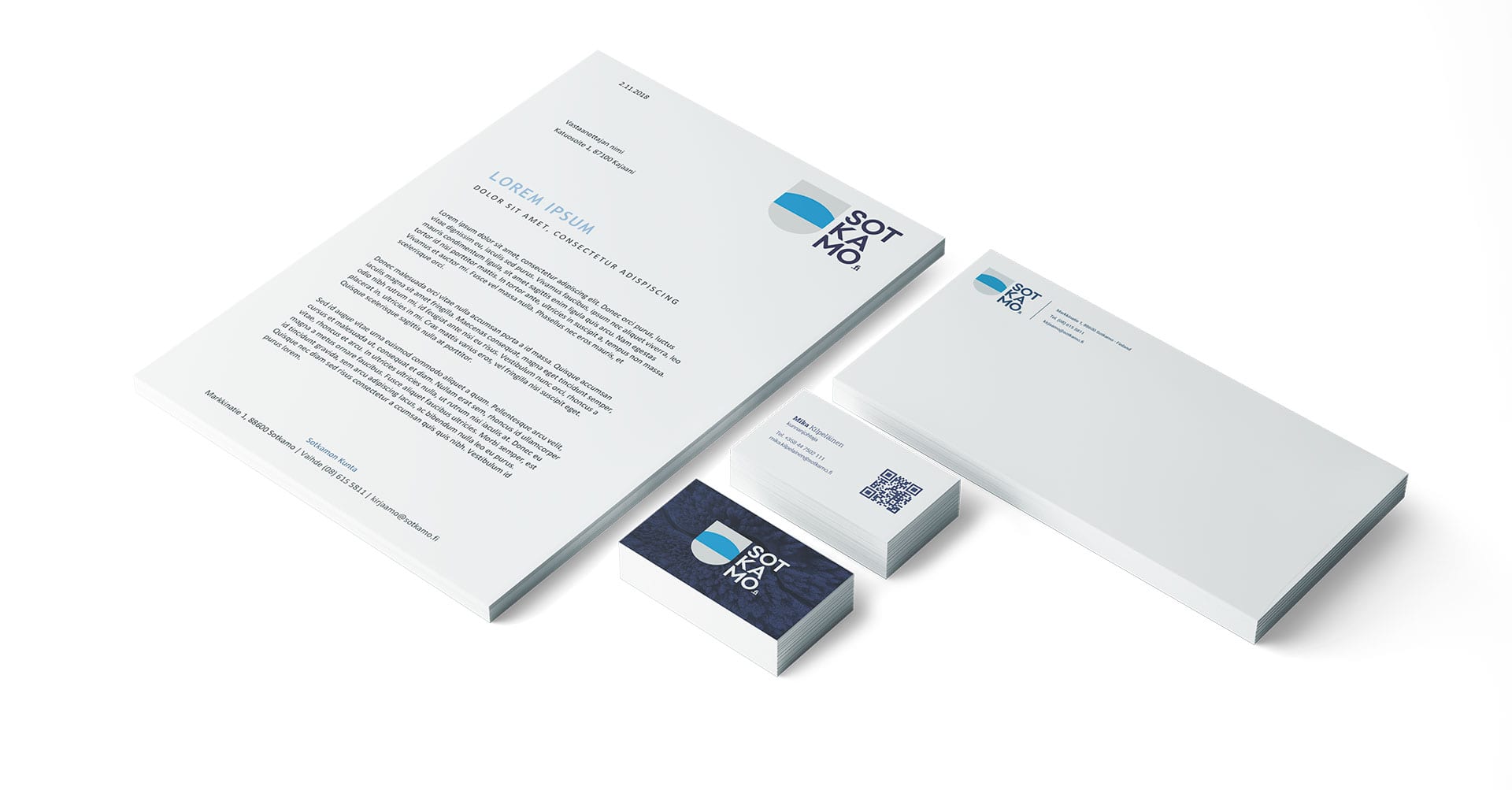
LOGO RENEWAL

In logo design, the color scheme, typography and usability combinations are the characteristics of a working logo. In the logo of the municipality of Sotkamo, these characteristics were also summed up in the visual appearance.

SOCIAL MEDIA VISIBILITY

The renewed look of Sotkamo municipality also needed social media visibility. To support that, we made a header video on Facebook.

COMMENTS

”The advertising source is a cost-effective alternative, modern, creative and that listens to the needs of the consumer. In the background of the graphic appearance of the municipality of Sotkamo, they found meaningful themes for the image world. Good customer service guaranteed a final result that both parties were satisfied with.”

Heidi Hanhela
Expert, Sotkamo Municipality

See More

Interested?

Contact us and together we will come up with a package that suits your needs.

Take Contact

SAMMY HYYRYLÄINEN

CREATIVE LEADER

Tel. 044 020 5250